TEA COLLECTION MOBILE UX + UI REDESIGN, 2016

PROJECT DESCRIPTION
I was the senior UX/UI designer for Tea Collection's mobile site redesign. The redesigned site was ranked as one of the top 10 best online shops in its category by Newsweek magazine.
Our goal was to increase conversion and long term brand loyalty by doing two things: designing a positive, user-friendly experience that enables the customer to easily find and purchase what they are looking for; and creating opportunities for brand engagement.
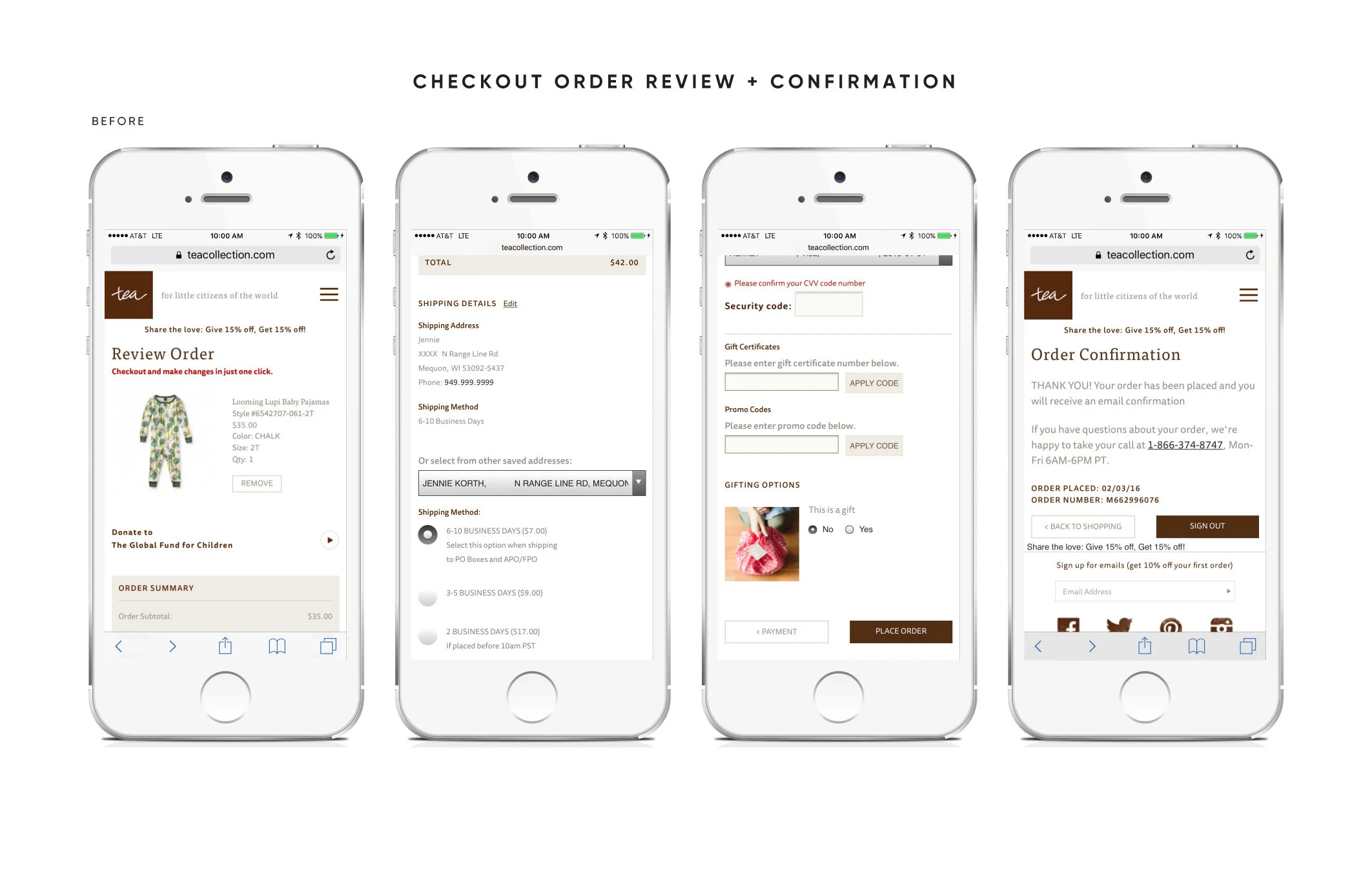
Working closely with the design director, we began with internal and competitive audits and customer journey mapping, which uncovered key weaknesses. Tea is known for unique, detailed prints and patterns. Our product images were too small and users could not zoom properly; the prints were difficult to see on mobile devices. The link to the ‘About Tea’ page was at the very bottom of the site, buried in the footer. Our screen real estate was not ideal, pushing important CTAs and content below the fold. And our checkout process was clunky and required too much time and effort to complete.
Design Direction: Hannah DeMoss
UX/UI Design: Katrina Fernella
pain points were addressed in the following ways:
Increased the image size on category and product pages to better show the clothing and print details.
Created a new zoom tool on product pages allowing customers to see fine details of the prints and patterns.
Included a link to ‘About Tea’ in the main navigation menu, to give customers an easy way to learn more about our brand story and values.
Optimized padding and layouts to keep critical content above the fold or isolated to a single screen, requiring no scroll.
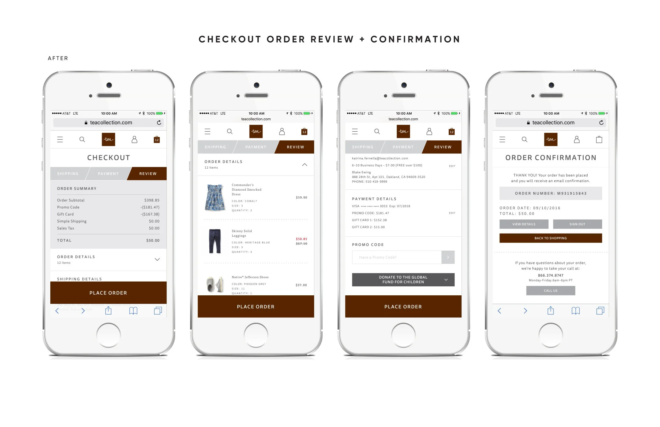
Implemented new functionality to simplify and speed up checkout, such as easier guest checkout, scan a credit card, auto-fill address fields and condensed form fields.
Partnering with the design director and the marketing team, I focused on improving key areas of our site to provide a better customer experience—navigation, category and product pages and a seamless checkout. My next step was to develop the UX flow for these areas, create wireframes and prototypes and design the user interface that defined the new brand standards. I lead the presentation to leadership and received approval. With the creative approved, I created detailed specifications and partnered with our developers to ship the final product on time.
The user experience improvements delivered a direct increase in traffic and conversion. And for the first time, mobile traffic accounted for more than desktop.
NAVIGATION
The header and icon system was designed to include key functions for the user that were absent from the old site: search, my account and shopping bag.
The new menu navigation was a full-screen takeover for ease of use. ‘About Tea’ was also added to the navigation menu.


SEARCH
The search functionality was improved by displaying suggested search terms as a user types.
CATEGORY PAGES
The category pages were redesigned to show more product above the fold and to enhance the filter and sort tools. A toggle button was also added, allowing a user to switch to a single item across to see product details better on a mobile device.


CATEGORY PAGE FILTERS
The filter tool was reimagined as a full-screen lightbox with a sticky ‘Apply’ button.
The previous site refreshed the page when a filter was selected, and only allowed one filter at a time. The new filter tool allowed for multiple selections at once and applied only after the user taps ‘Apply’.
PRODUCT PAGE
The product page was redesigned to display a larger image, zoom in on the image easily and to include a clear swipe functionality.
A key function added to the product page was the ability to select and shop multiple colors of the same style. The previous site had separate pages for each color.


IMAGE SWIPE AND ZOOM FEATURES
A zoom feature, lacking on the previous site, was added to the product page and allowed users to easily see key product details.
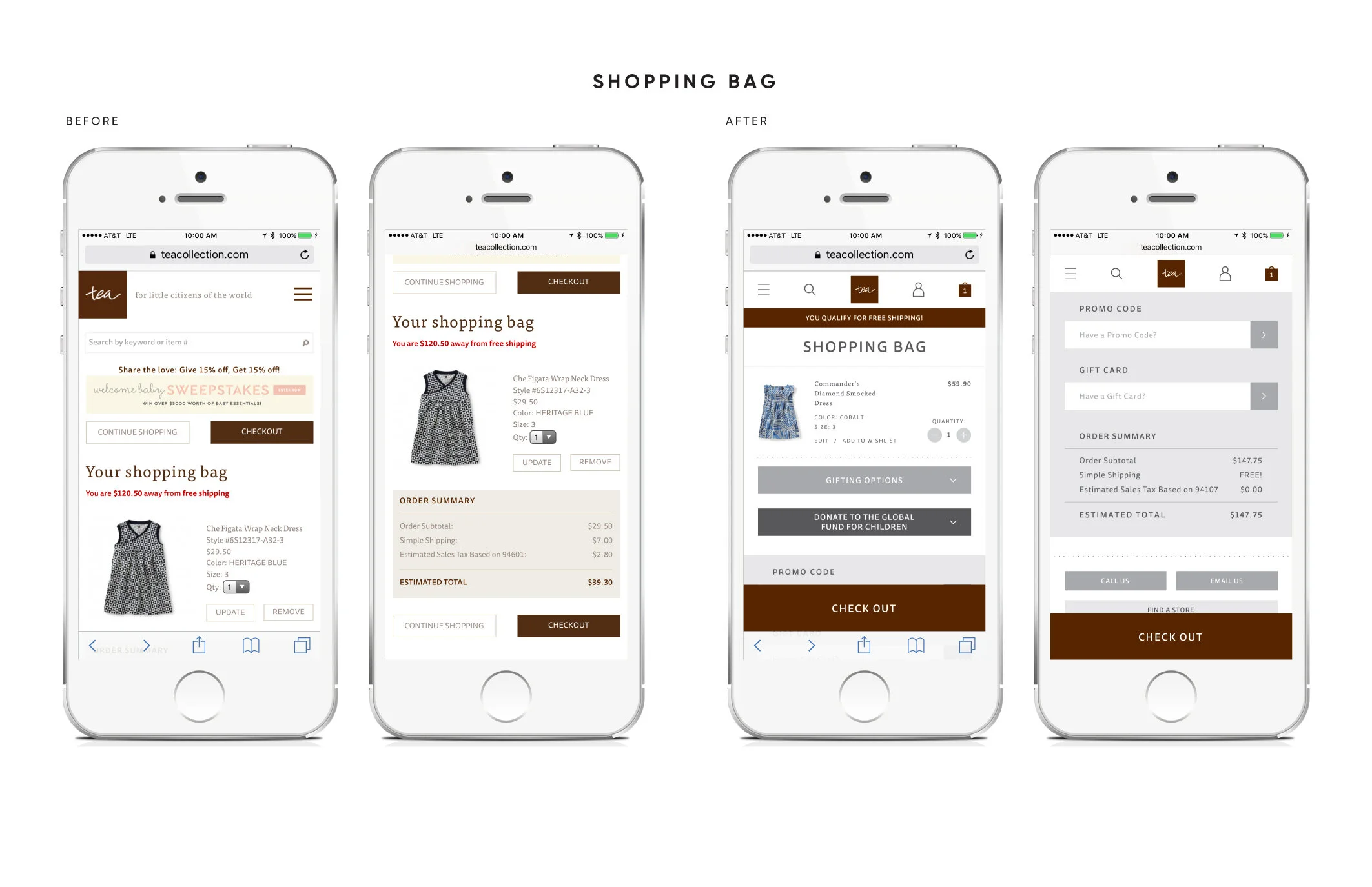
SHOPPING BAG
Key functionality added to the shopping bag included:
• Sticky ‘Check Out’ bottom button, so the user can easily checkout without needing to scroll to the top or bottom of the page.
• Promo code and gift card entry fields were added. The previous site only accepted and applied promo codes and gift cards at the payment phase of checkout.
• Gifting and donation options were added here, previously only available in the final order review phase of checkout.

CHECKOUT SIGN IN PAGE
The first phase of checkout was simplified with three buttons and condensed to fit everything above the fold.
Selecting ‘Sign in to my account’ opened up form field options to sign in.
Selecting ‘Check out as a guest’ takes a user to the shipping step in checkout, simplifying the process. The previous site downplayed guest checkout, requiring users to search it.
CHECKOUT SHIPPING PAGE
Key functionality added to the shipping page included:
• Address auto-complete
• Shipping method selection changed from radio buttons to a drop down menu to save screen real estate
• Sticky and functional progress bar added to the top of the page. A user can navigate back to a previous step if needed.

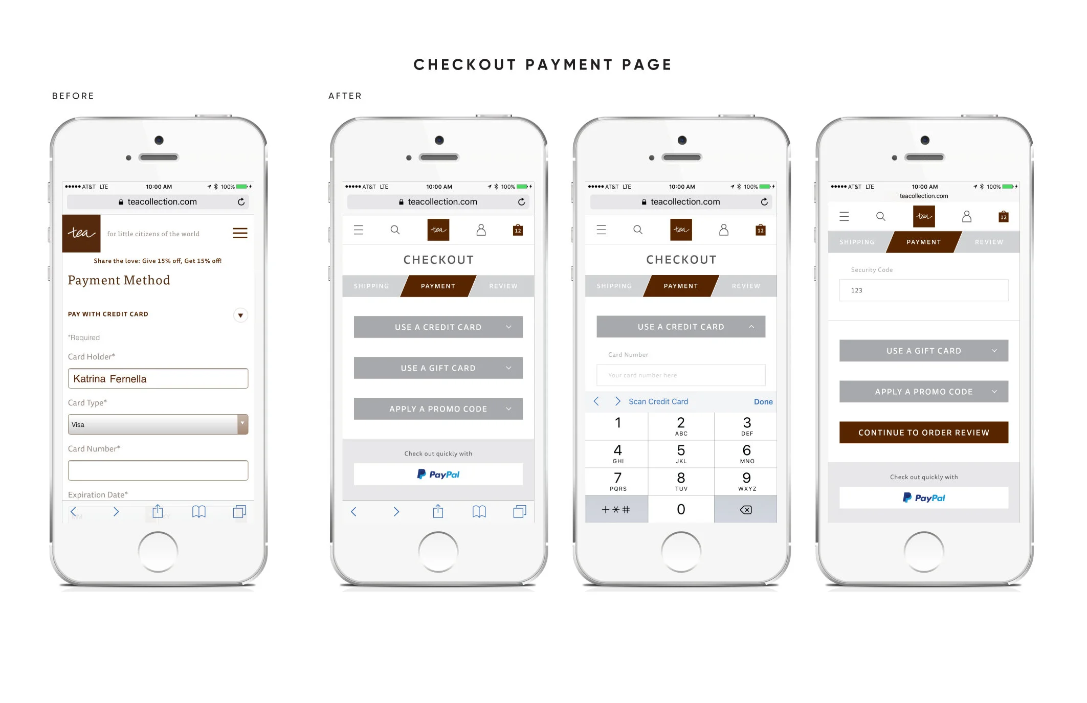
CHECKOUT PAYMENT PAGE
Payment options were condensed into a visually simple group of buttons that all fit above the fold.
The ability to scan a credit card was added.